

Overview
Forage is an app for a non-profit organization. It aims to organize pickup times for folks wanting to donate food items to families in need. You can leave a bin of canned foods or non-perishable food items outside your house and with a simple pickup request from our app, our Forage trucks will come pick it up.
The challenge
My task was to design the whole app experience and I used a lean UX approach I usually apply to startups I work with. This is a great method to develop an fast and good MVP.
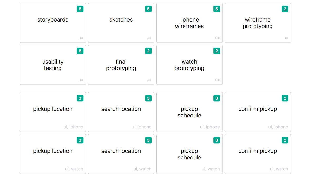
My budget for this project was 20 hours and with this limit in mind, I created cards with all the tasks and features I planned to do. I used the Fibonacci sequence (1, 2, 3, 5, 8) to point the cards and a total of 54 points to the 20 hours. This helped me to estimate the roadmap and define the priority and importance of every feature/task.
Selected Cards
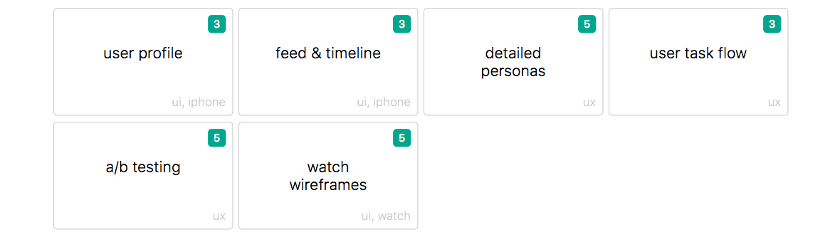
Remaining Cards
Storyboarding
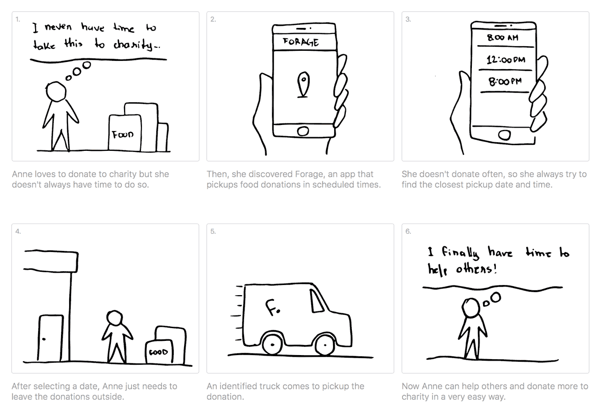
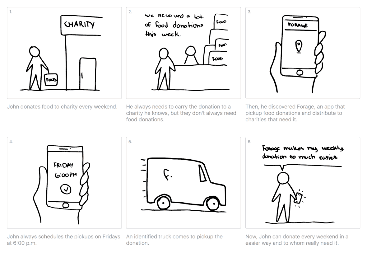
To understand existing scenarios, identify pain points and have a widely view of the problem, I decided to create basic personas and work with storyboards. In the process I found two different people: one who donate in several different dates and times and other that donate often, on the same day and time. It helped me to create empathy with the personas and gave me a better perspective to design the schedule interface.
Anne’s Story
Anne is an architect and she likes do make donations from time to time.
John’s Story
John works on a restaurant and he likes to donate leftovers every weekend.
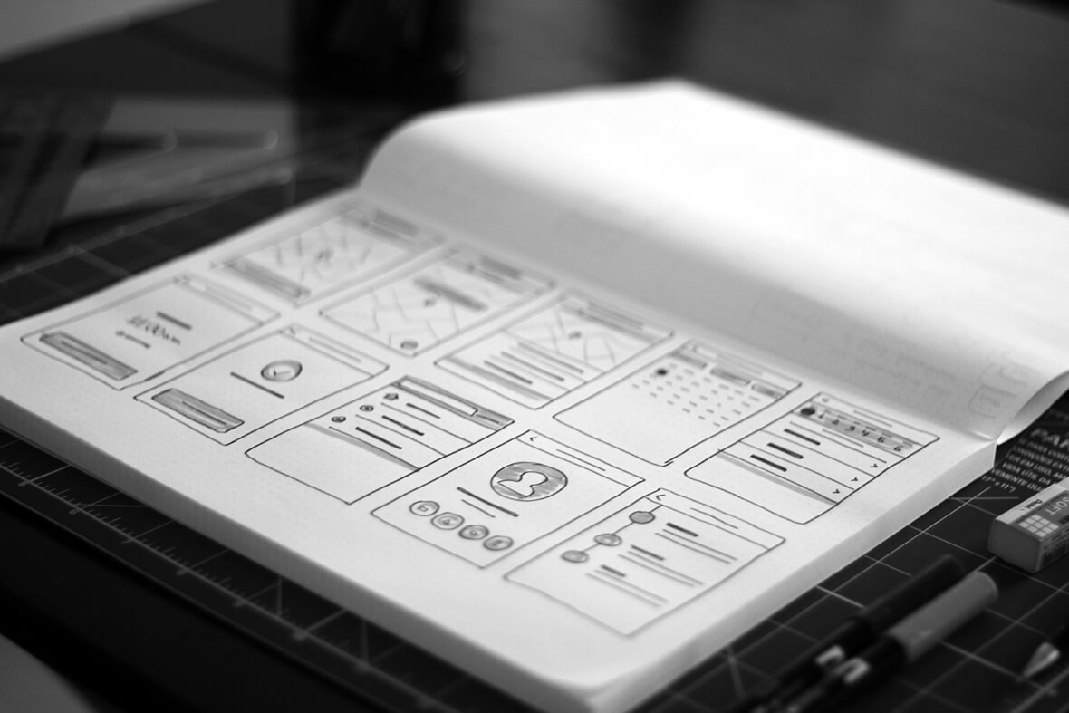
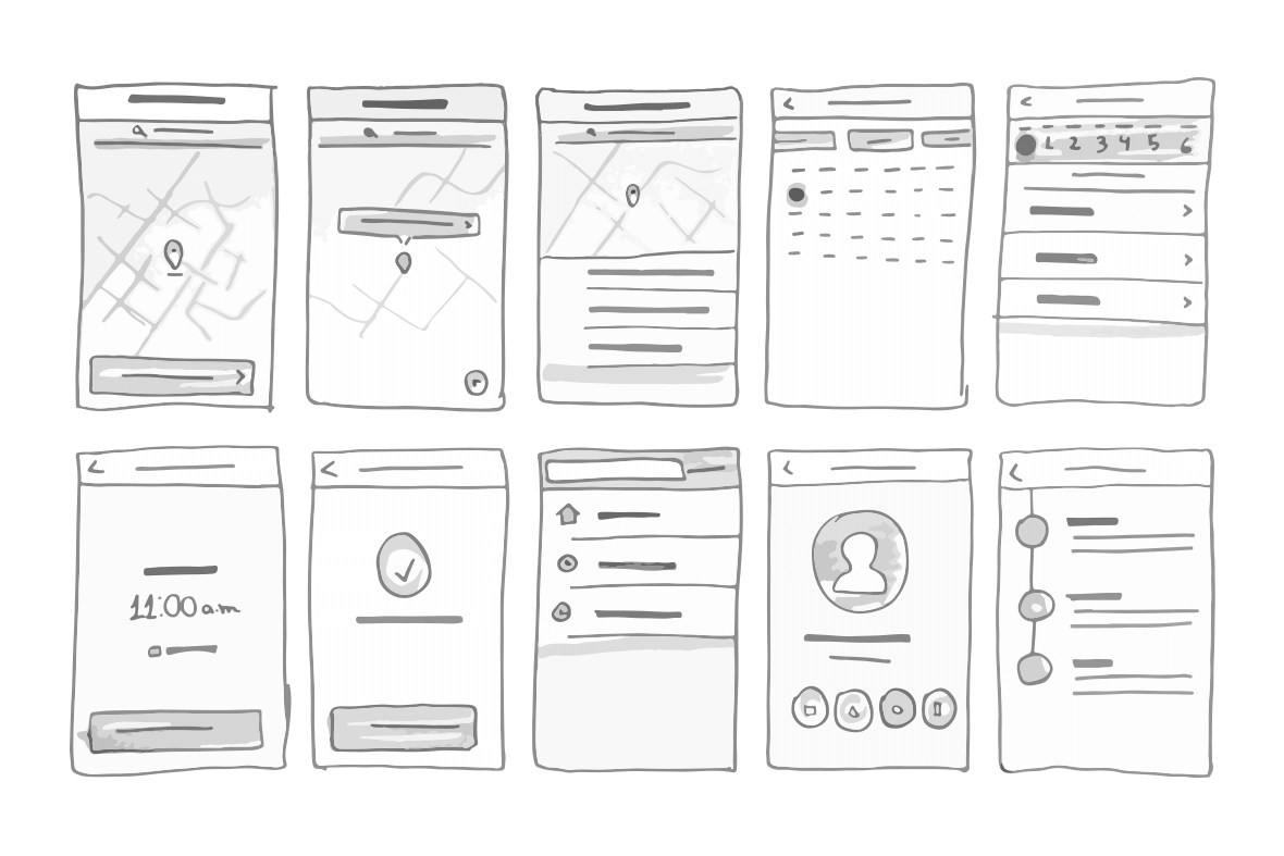
Sketching the concept
With the personas in mind, I started to sketch the concepts of the interface. I think this is the fastest way to get some ideas of what I need to do. I used these rough sketches to show my concept to some people and validate it.
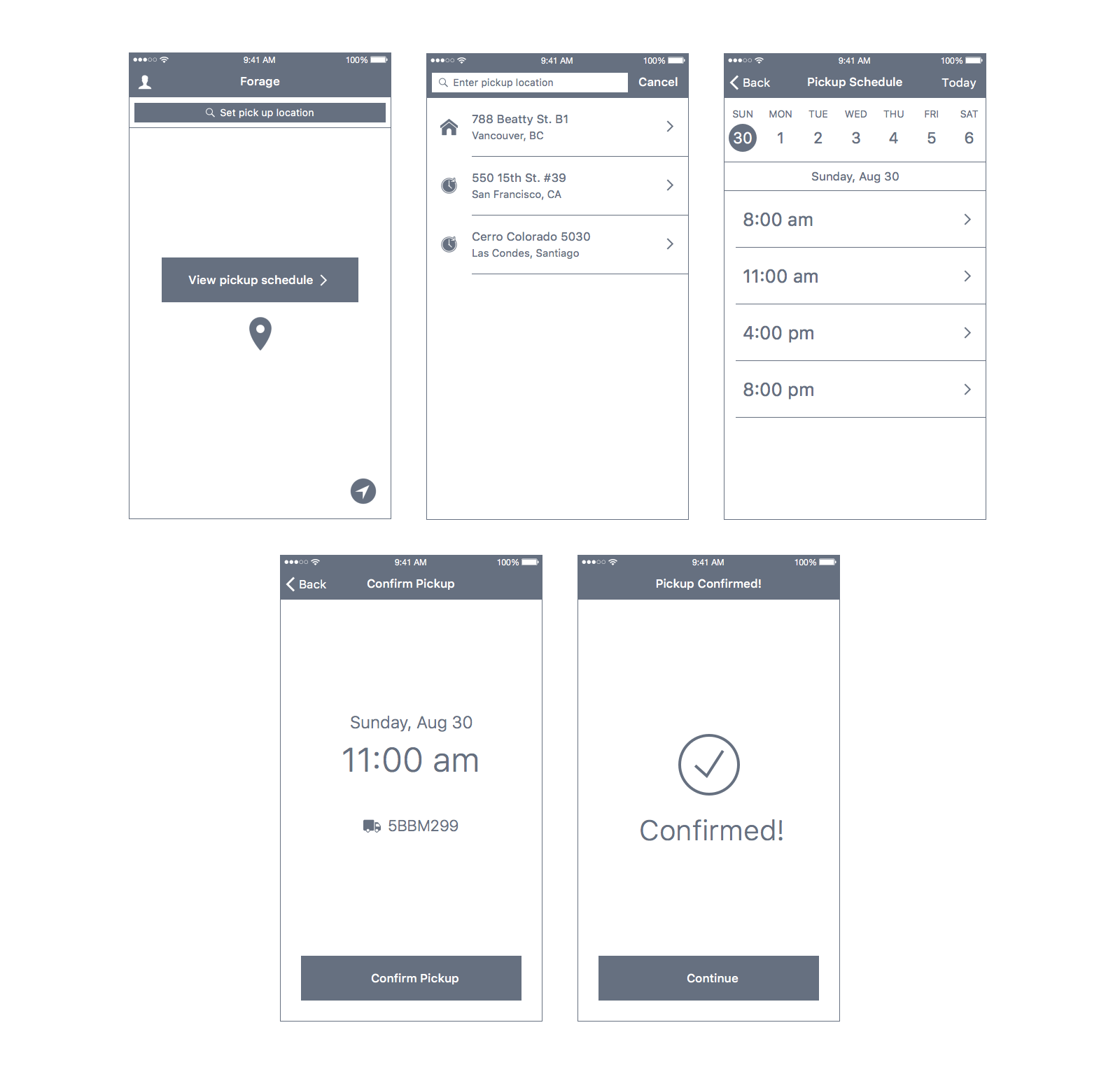
Wireframing and prototyping
After I validated my sketches, I started to design high fidelity wireframes and made an prototype in order to test the final process with the users.
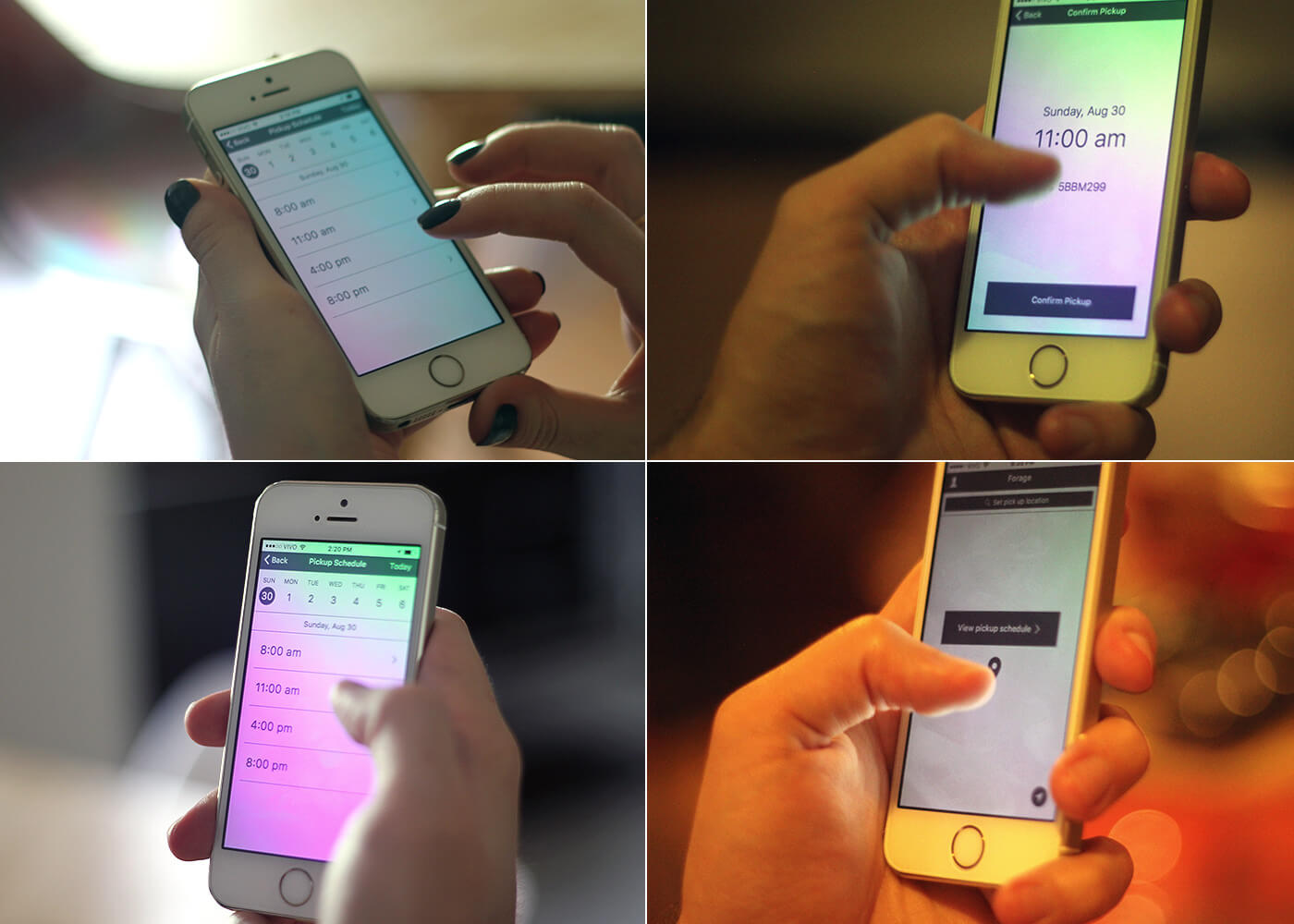
Usability Testing
Since I didn’t have a lot of time/budget, I decided to test the prototype with 4 friends. I know they aren’t the best choice but I think every idea should be tested in some way before moving to the next step.
I tested three main tasks:
- Schedule a pickup on the closest day/time;
- Schedule a pickup to next week;
- Schedule a pickup at your work.
All the users completed the tasks with no problem. With it validated, I moved to the final design.
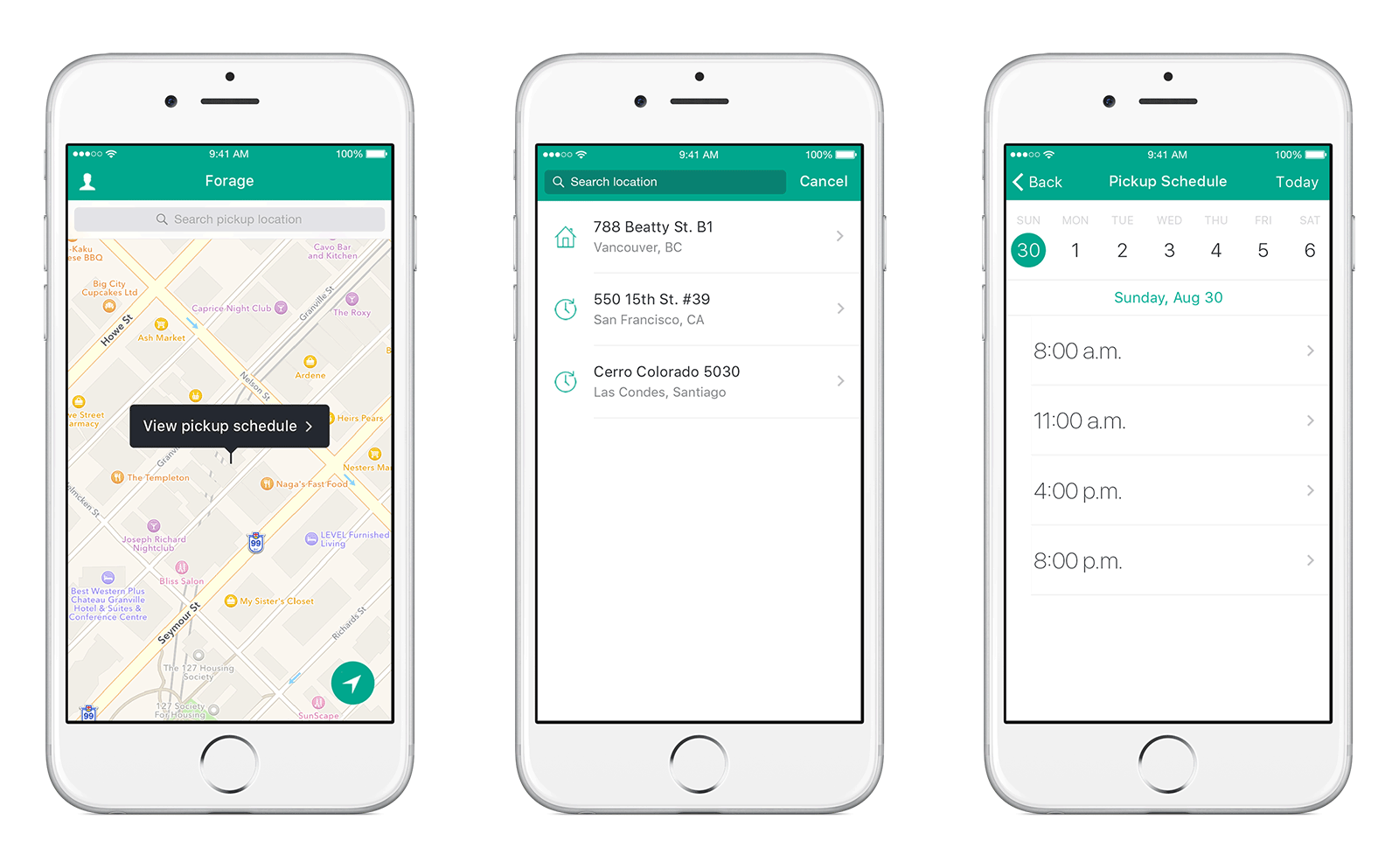
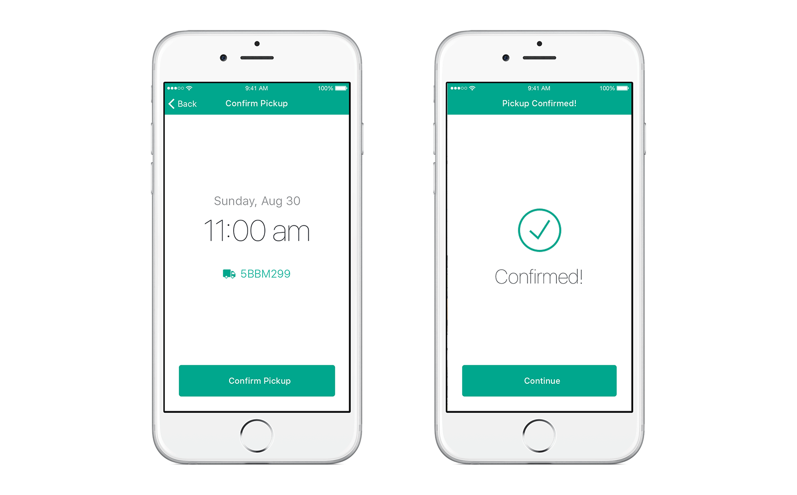
Final Outcome
I tried to keep the interface the most simple possible, using the iOS guidelines wherever it was applicable. Since I didn’t have any logo or branding, I decided to use green as main color.
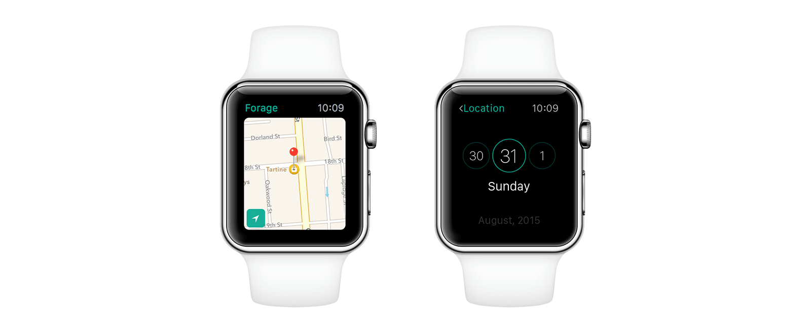
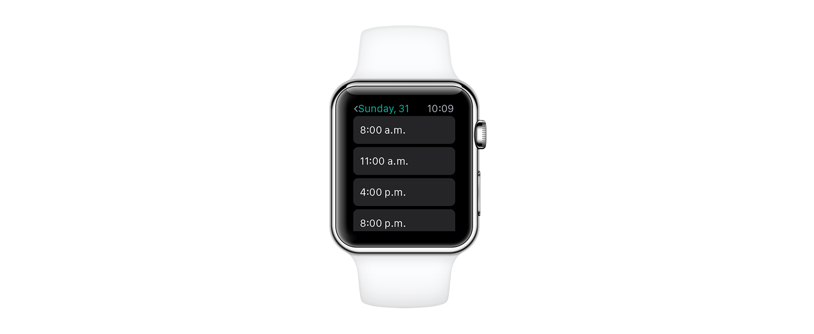
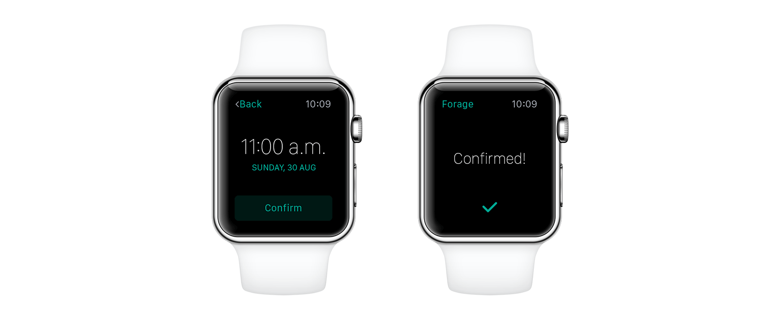
Apple Watch
Apple Watch is a great tool to improve the overall experience of a user, but the features need to be carefully chosen. The pickup flow is really simple and could be easily be adapted to the Watch. The interactions are super quick and can be understood instantly.
Final Toughts
It’s always great to research and get to know more about different kinds of users. I learned a lot thinking about the user stories and even more with the usability test and interview. The people might have several different needs to get to the same final task, and it’s very important to discover, understand and facilitate these pain points.
The hardest part was to stick to the 20 hours of project even feeling there was so much more I could do. But I think it’s really important to understand priorities and respect the defined roadmap, specially with an MVP where testing and validating the idea as soon as possible is the most important task.
If I could go back and give myself an advice it would be to talk to people sooner. I think it took me more time than it should to understand that some people could make donations more often or schedule the pickup for the next week, for example. If I had understood it soon, the process would be much easier.